Image: Google via AFP Relaxnews
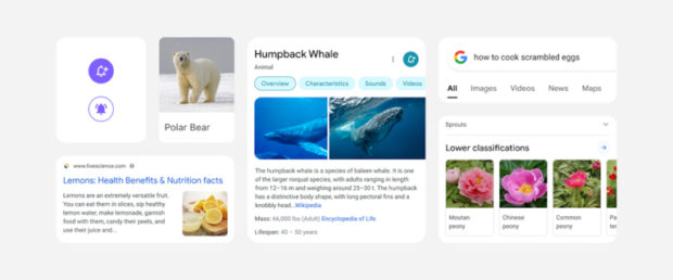
Google has announced the imminent arrival of a revamped mobile search interface. Due in the coming days, the refreshed interface, unveiled via a handful of images, promises a simplified design, making search results clearer and faster for users to navigate.
In the first images published by Google, the design appears to have been modified slightly, with a simpler, more pared-down look, featuring more rounded lines and fewer shadow effects. To make text easier to read, Google plans to slightly increase the size of titles, and the text describing results will now use the full width of the screen, all to help the eye scan and understand search results more effectively. The same goes for color, which is used to highlight what’s important while distinguishing different types of results.
The overall aim of this revised interface is to help focus the user’s eye on the information they’re searching for, without any distraction from unnecessary effects. According to Google, the design has a more “refreshing” feel.
This new interface is in the process of being rolled out and should be accessible to all users worldwide in a matter of days. Its aim isn’t to overhaul everything, but to achieve an enhanced version of familiarity. In the end, changes remain minimal, but this new interface promises improved readability and greater clarity thanks to a series of small improvements. JB
RELATED STORIES:
Revamped White House website features hidden message for coders
Punk band Converge gets complaints from Filipinos over internet woes