The classic Kodak logo is back and with it the company’s plan to revive itself. Image Kodak
Just last week, Kodak unveiled a new device that features a digital-camera technology wrapped in the guise of the ubiquitous smartphone and clad in a nostalgia-inducing design called the Ektra. This time the company revives its iconic “K” brand logo with a modern twist.
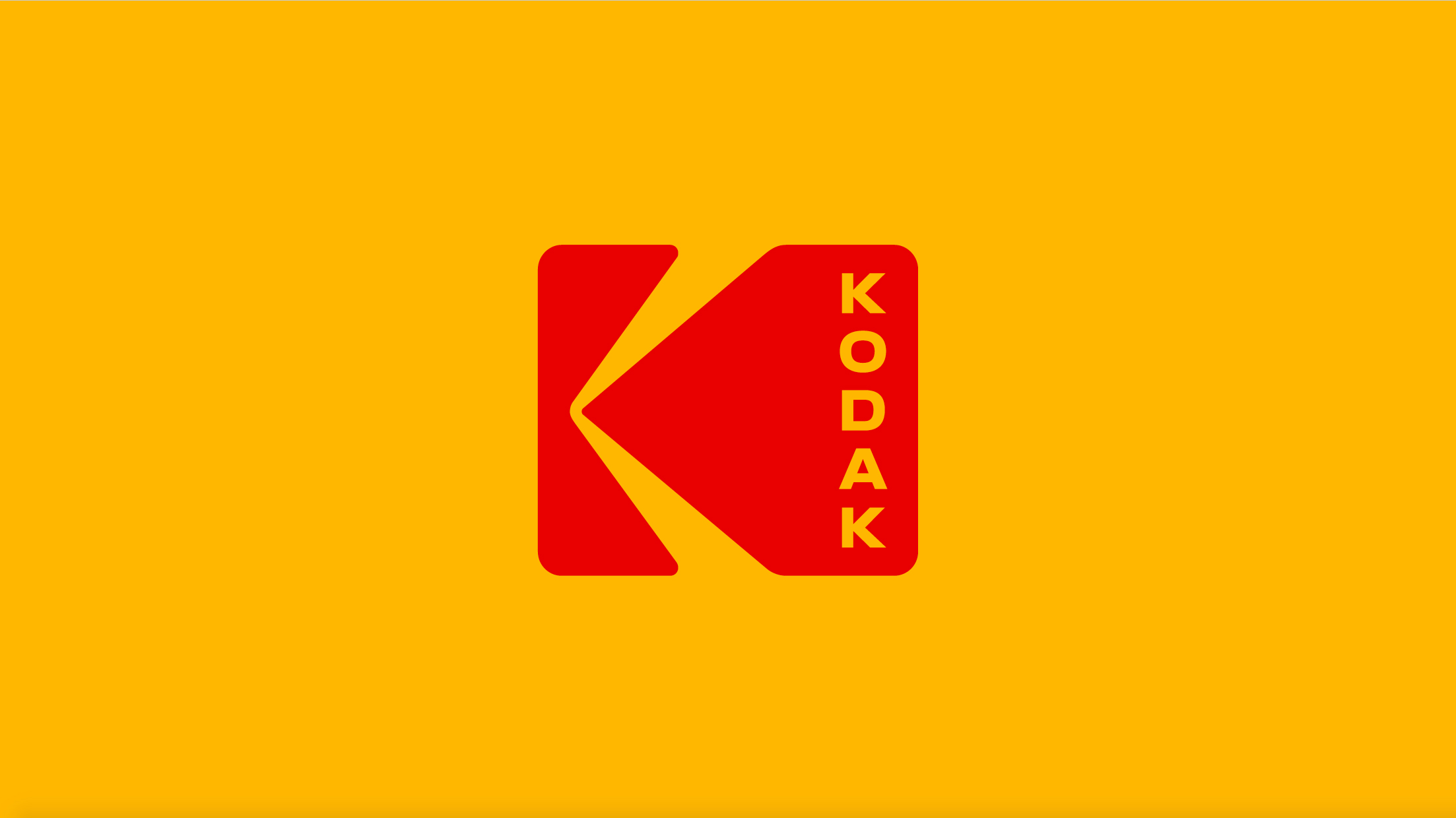
The original red and orange Kodak “K” was designed by Peter Oestrich and was adopted by the company in 1971. It has represented the Kodak until 2006 when it tried a modernized look by simply using a red wordmark, reports Wired.
Now with a revival plan in hand, Kodak approached New York design studio Work-Order to bring back Oestrich’s design. Keira Alexander, a partner at Work-Order said, “We said, ‘fantastic,’ because we would see no other way than to take it back to this symbol. It’s such a valuable asset, it would seem fruitless to begin again.”
Work-Order did add its own little touch to the revived logo by including “Kodak” in bold, capital letters stacked vertically to the right of the “K” to evoke the sprocket holes on the edges of film rolls.
Oestrich’s design also has a few meanings hidden in plain sight. Depending on the perspective, the two arms of the “K” symbol can either be seen as beams of light pouring into a camera viewfinder or being projected unto a screen. Alfred Bayle
RELATED STORY