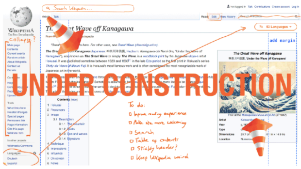
Wikipedia will be getting its first substantive redesign in a decade. Image: diff.wikimedia.org
The desktop design of Wikipedia is getting its first makeover in 10 years to make the site easier to navigate for new users.
The Wikimedia Foundation announced the upcoming changes to the online encyclopedia in a blog post on Sept. 23.
“While Wikipedia’s content has grown rapidly, our interface has not kept pace,” Olga Vasileva, lead product manager at the foundation, said.
She added that the lack of changes over the last decade has left parts of the site “clunky and overwhelming” to its readers.
Through the redesign, Wikimedia aims to make its content easier to read for new users of both the site and the internet. Vasileva cited that these users may feel overwhelmed by the site’s current look.
Among the future changes are a reconfigured logo, collapsible sidebar, maximum line width and one-click access to preferred languages. The organization is targeting to finish the new look by the end of 2021, in time for the site’s 20th anniversary.
The collapsible sidebar will let users hide the menu to help them focus on the content itself. Meanwhile, the maximum line width will help readers retain more information and decrease eye strain, according to research.
“We want to create an experience that feels similar to our long-time users, yet straightforward and intuitive for new folks,” Vasileva noted.
Wikimedia will be introducing the new features incrementally in the coming months to give time for testing and feedback. Plans to revamp the desktop interface began in May 2019.
The foundation also stated that the announcement is the first in a series of the redesign efforts. While the desktop interface is set for a new look, Wikimedia did not state if the mobile version would be getting changes as well. /ra
RELATED STORIES:
Educated yet amoral: AI capable of writing books sparks awe
WATCH: ‘Harry Potter’ role-playing game ‘Hogwarts Legacy’ all set for 2021