





Why Africa looks smaller than it really is on Google Maps


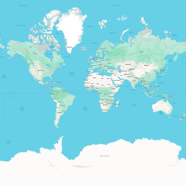
Africa is not happy with how Google Maps portrays it.
The popular Mercator map projection, used by Google Maps and many other online maps, distorts the size of landmasses, making Africa look small compared to other continents, despite being the second-largest after Asia. The disparity is easily seen when comparing Greenland to Africa. On the Mercator map, Greenland looks almost the same size as the continent, but in reality, Africa is 14 times larger than the Arctic island.
On April 7, the 55-member African Union tasked member state Togo to draft a resolution that the United Nations General Assembly could deliberate in September. This resolution will encourage the world’s governments and other global institutions to “Correct the Map”—essentially stop using the Mercator projection, developed by Flemish cartographer Gerardus Mercator in 1569, and instead adopt the Equal Earth projection, created by American mapmaker Tom Patterson (and others) in 2018.
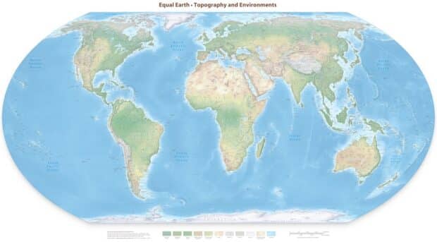
Showing Africa’s true size is not just a matter of geographical accuracy. As the “Correct the Map” campaign states, “we aim to shift perceptions and highlight the true scale, power, and potential of the African continent.”
All (flat) maps lie
Unless you are holding a globe or interacting with a 3D user interface that models a spheroidal Earth, all world maps will misrepresent the Earth.
There are hundreds of map projections, and they all make intentional errors in representing places, whether in terms of shape, size, distance, or angles, because they want to highlight or preserve some other map aspect.
RELATED STORY: Digitally mapping the Philippines’ historical markers
The Mercator projection, in particular, favors conformality, which is the mathematical property that preserves local shapes and angles. This makes it a particularly good projection for navigation, which is why its popularity has endured for centuries. The problem is that the Mercator compromises on area and distance, diminishing the size of places near the equator, like Africa, compared to farther locations like North America and Europe.
What about the Equal Earth projection? As the name implies, its aim is to preserve size, ensuring that all places are shown with their correct surface area relative to each other. This, however, results in errors with respect to shape, distance, and angles. For instance, there is a noticeable vertical stretching of equatorial landmasses, which actually makes Africa “taller” than it really is.
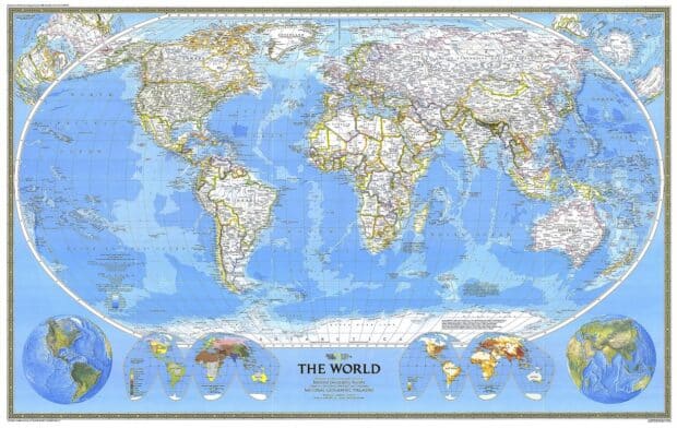
While the Mercator is a popular projection for creating world maps, it is by no means the default. For instance, the venerable National Geographic Society has used numerous projections in its history, including the Winkel Tripel, the Mollweide, and the azimuthal equidistant projection. Shown below is NatGeo’s 1988 world map in the classic Robinson projection, which was the inspiration for the Equal Earth projection.
Google Maps adopts the Mercator
When Google Maps was first introduced in 2005, it settled on a variant of the Mercator, now commonly called the Web Mercator projection. Remember how the Mercator is a conformal map projection that preserves local shapes and angles? Well, it was precisely this quality that Google appreciated. You can zoom smoothly into a city and every rectangular building will look rectangular and circles don’t look like ovals. (In the Equal Earth projection, buildings in Australia would look distorted.)
RELATED STORY: Should we be worried about Google Zero?
The Mercator also has other unique desirable properties that make it very suitable for an interactive zoomable map. First, the Mercator is a cylindrical projection, which makes all meridians vertical, and all latitudes horizontal. This means that Google doesn’t need to constantly rotate the map to preserve the north-equals-up orientation, unlike with the Equal Earth projection.
Second and more importantly, most of the world can be represented as a square. Due to the technical limitations of web browsers in the 2000s, Google Maps could not recreate a user-friendly interactive globe (a la Google Earth). (Nowadays, thanks to the advancement of browser technologies like WebGL, you can switch to a nice globe view on the Google Maps website, sidestepping the whole map projection problem.)
Instead, Google subdivided the world into square map tiles. Zoom level 0 is basically the whole world as a single square tile. Zoom level 1 divides the world into four square quadrants. Thereafter, every subsequent level divides each tile into four smaller tiles. And Google can generate all of these tiles ahead of time and quickly load them into the browser as needed when the map user zooms and pans the map, leading to a very smooth user experience.
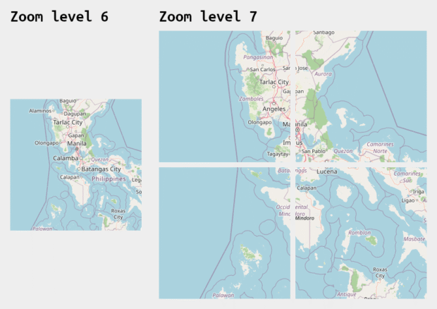
This tiled map innovation was so good that other online mapping providers, such as Bing Maps, Mapquest, and OpenStreetMap, quickly adopted this technology.
Initially, Google’s variant of the Mercator projection was rejected by the EPSG Registry, the directory of map projections (and datums and coordinate systems) widely used by geographic information systems (GIS) professionals. The maintainers of the registry said they “have reviewed the coordinate reference system used by Microsoft, Google, etc. and believe that it is technically flawed.”
But Google’s invention was so popular that mapmakers informally used the EPSG:900913 identifier, where “900913” is “GOOGLE” transliterated to numerals. The clamor grew so loud that the registry capitulated in 2008 and officially assigned the EPSG:3857 identifier to the projection, giving it the official name “WGS 84 / Pseudo-Mercator”.
What now?
The Web Mercator projection is so popular that I have no doubt that the African Union views its widespread use as a concern. Whenever you view any interactive online map, chances are you are looking at a Mercator map.
I fully support the union’s campaign to replace Mercator world maps with Equal Earth or another suitable projection, especially in classrooms and corporate offices that often have printed and mounted wall maps.
But given the technical advantages of the Web Mercator projection, I don’t believe that we will see its use decline anytime soon. The Web Mercator projection is computationally simpler compared to other similar projections, but that need for simplicity should diminish with time as technology advances.
The debate over Mercator versus Equal Earth is not really about finding the perfect map. No such map exists. It is about choosing which distortions we are willing to accept and for what purpose. A wall map in a classroom serves a different purpose from an interactive navigation app on a smartphone.
In the meantime, it would be really nice to include map literacy in the curriculum of geography, earth sciences, and history classes, thereby helping students understand why different maps look different in the first place. As a map geek, I view knowing that maps are not accurate in one way or another as a fundamental piece of knowledge that everyone ought to have.


