Google Maps gets facelift for subtler look

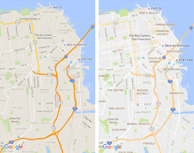
The left image shows Google Maps before the update and the right one shows it with the revamped color scheme. Image Google Blog
If you haven’t updated your Google Maps app yet, now would be a good time. Google has rolled out a facelift for the app that should make it easier on the eyes for navigation and looking for points of interest.
The latest update is meant to “de-clutter” the interface of Google Maps and achieve a kind of balance in terms of the information being presented to the user. For starters, elements such as road outlines have been taken out to make it easier to spot traffic and transit points.
Typography has also been improved for street names and points of interests, among others, to make them more distinguishable from all the other elements on the map. The goal is to lessen the distractions as users try to navigate.
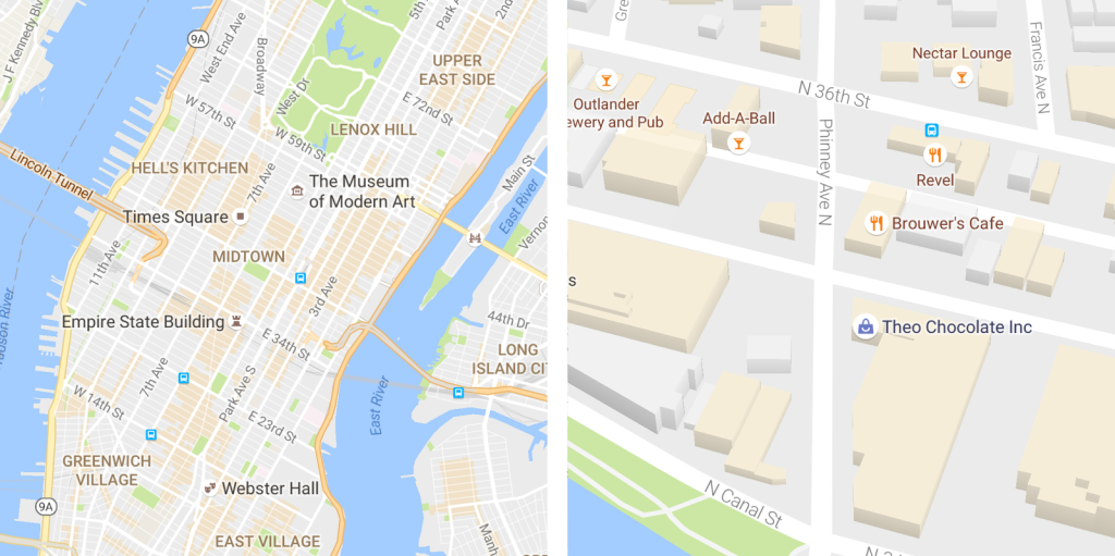
Areas of interest are shaded in washed-out orange hue. Zooming in reveals more details within the area. The color for “areas of interest” is determined by an algorithmic process that highlights areas with large concentrations of restaurants, bars and shops. Higher-density areas require a more human touch to ensure that the map is showing the most active areas.

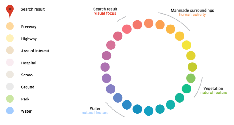
The new color scheme has subtlety in mind while providing clear color differences for man-made locations. Image Google Blog
Finally, the most notable part of the update is the overall color scheme. Apart from being much more toned down and easier on the eyes, it is designed to help users differentiate between man-made and natural features. Places like hospitals, schools and highways will be much easier to spot. Alfred Bayle
