LOOK: YouTube launches new logo, new look and ‘Dark Theme’
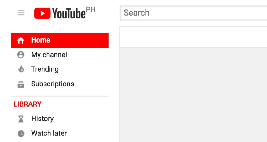
Image: YouTube
After 12 years of service to the internet, YouTube is once again transforming how it looks and delivers video content.
The first thing to change is the logo. Its new design takes the red block out and places it before “You” with a white “play” icon in the middle.

Image: YouTube
Next, the desktop version will now reflect a minimalist Material Design interface to make it look cleaner and simpler. Along with the redesigned interface is a Dark Theme which essentially switches the standard white background into shades of black.
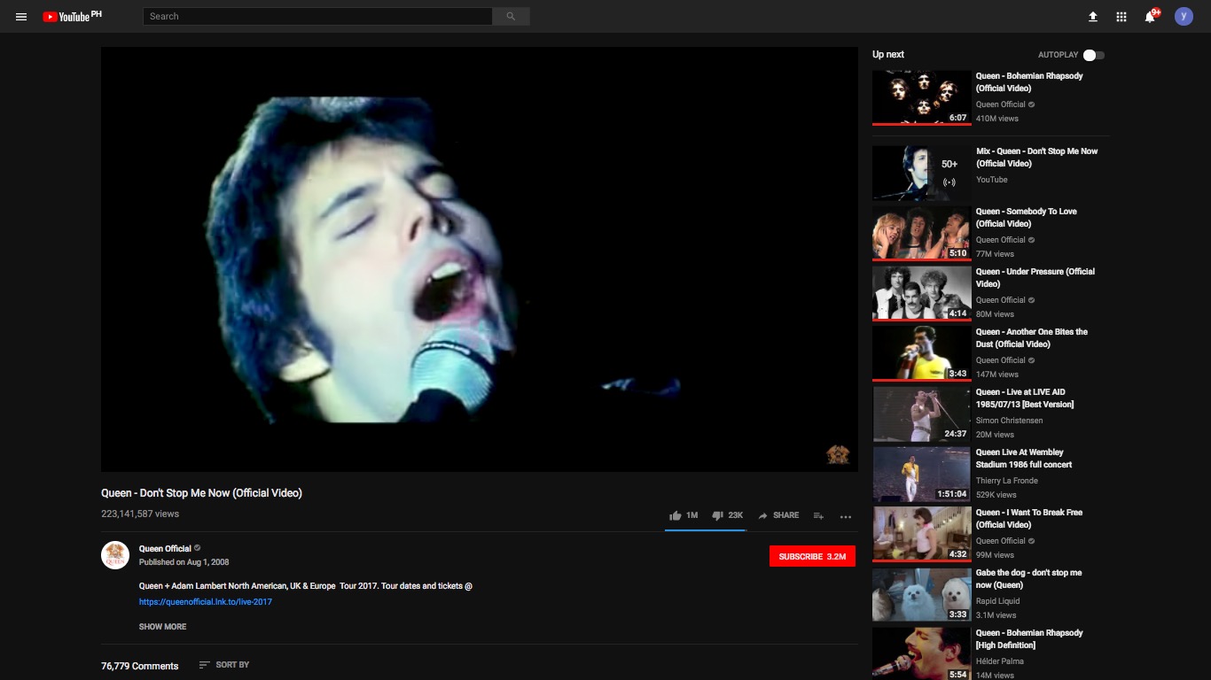
Image: YouTube
YouTube is also experimenting with a morphing player window which will change shape based on the video being played. The player would automatically reshape when a vertical video is being watched. This will eliminate black bars that appear when playing vertical or non-HD videos.
As for the app version, it will also get a cleaner interface and additional gesture control. Currently, users may double tap the sides of the video to rewind or fast forward. A future update will introduce swipes to allow users to browse through videos by swiping left or right, like in dating apps.
To access the new interface, simply type in “https://www.youtube.com/new” into the address bar. This will open a new page which will prompt the user to get the new interface.

Image: YouTube
One of the indicators of having the new interface is the presence of these dots beside the user profile icon. Clicking on the user icon also opens a drop down list which includes an option to turn on Dark Theme.

Image: YouTube
Turn on Dark Theme for a less glaring white interface.
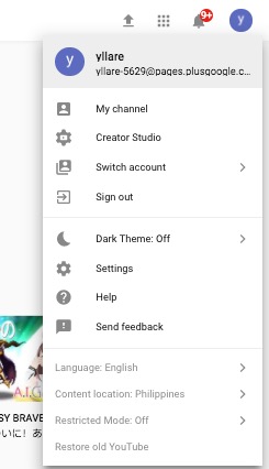
Image: YouTube
As of this writing, the new interface does not automatically load yet, but doing the simple procedure mentioned should work and get users shifting to the new theme. JB
RELATED STORIES:
LOOK: Happy pig rescued from flood, becomes new meme celebrity
WATCH: Cockroach swarm fights for survival as typhoon Hato hit Macau