Pinterest makes changes to its characteristic tile display

Image: Pinterest via AFP Relaxnews
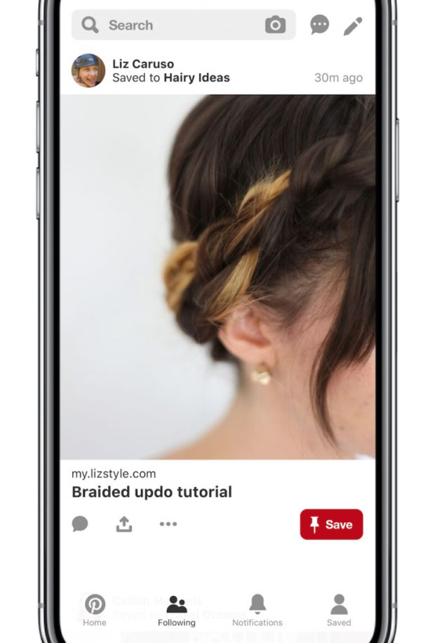
Drawing inspiration from Instagram, Pinterest is redesigning its mobile applications with an “immersive single Pin format.”
After introducing the “chronological following” tab in March of this year, Pinterest recently followed up with another mobile interface update: To further build on this modification, a single tap on a Pin from this tab will redirect users to the corresponding website.
This veers traffic towards the creators — influencers, publishers and brands.
Additionally, the mobile application company adjusted the feed to display just one image at a time, like Instagram, to allow users to scan more seamlessly from idea to idea. With the various options to view this feed, based on chronology or algorithmic patterns and the ability to switch between them, Pinterest is striving to give its audience as much control as possible.
The social network is also emphasizing that the “following tab” makes it easier for holiday shoppers to scroll from product to product.
The mobile update is rolling out across the world this week. KM
RELATED STORIES:
Polaroid celebrates Mickey Mouse’s 90th anniversary
Those who spend more time on social media feel more socially isolated